iOS 12.2: What Does AQI in Apple Maps Mean?
Yesterday I discovered something new in iOS: AQI in Apple Maps. It’s a new feature that came with iOS 12.2. Here’s what it means.
[Russia Wants Apple Maps to Show Crimea as Russian Territory]
AQI
AQI stands for Air Quality Index. This is a measurement used by government agencies to tell us how polluted the air is, or will be in the future. Today when I took a screenshot, the AQI for my city is 29.
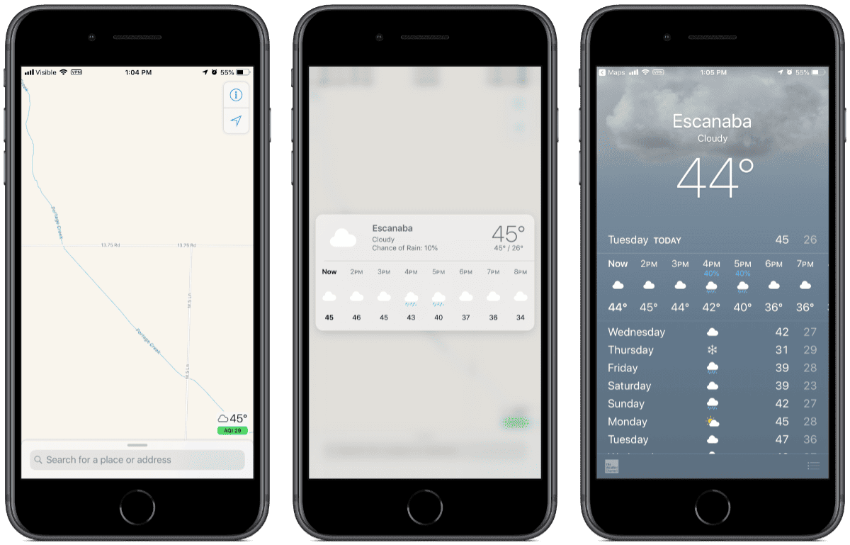
The AQI runs from 0 to 500. A score of 29 is pretty good, and represents good air quality with low potential to affect public health. Here are the value ranges that the government measures:
- 0-50: Air quality is good. Color: Green
- 51-100: Air quality is moderate. Color: Yellow
- 101-150: Air quality is unhealthy for sensitive groups, like people with allergies. Color: Orange
- 151-200: Air quality is unhealthy. Color: Red
- 201-300: Air quality is very unhealthy. Color: Purple
- 301-500: Air quality is hazardous. Color: Maroon
Displaying AQI in Apple Maps is a feature brought with iOS 12.2. The iOS Weather app also has an AQI score, brought with iOS 12. If you have an iPhone with 3D Touch, you can lightly press (Peek) on the weather icon to bring up a 7-hour forecast. If you press harder (Pop) it will bring you to the Weather app.
[How to Use Maps on Your iPhone to See the Hourly Weather Forecast]
0 Response to "iOS 12.2: What Does AQI in Apple Maps Mean?"
Post a Comment