Music for iOS 10: A Tour of the Big Changes
Music got a complete redesign in iOS 9 last year for the arrival of Apple Music. The result was a cluttered, confusing interface that didn’t go over well, but, fortunately, Apple clearly listened. iOS 10 will arrive some time this month, and it brings a pretty big overhaul to Music for iOS. I think it’s a huge improvement, so let’s take a brief tour to get acquainted with what changed, disappeared, and improved.
Apple’s new testing ground
iTunes has long been considered Apple’s “UI testing ground.” It’s been the app for tinkering with the company’s new interface ideas, though they aren’t guaranteed to make it to the rest of the OS. For (mostly) better and for worse, I think Music has become that testing ground in iOS 10.
The most obvious change in this area is large, bold text labels for major sections throughout the app. At first glance it might feel unorthodox or jarring, but it’s grown on me. I wager most people’s music libraries have grown pretty large these days, whether filled with purchased downloads or a wealth of streaming bookmarks. The bold labels help bring organization to a large volume of content. I feel they also break up what used to be a visually chaotic app.
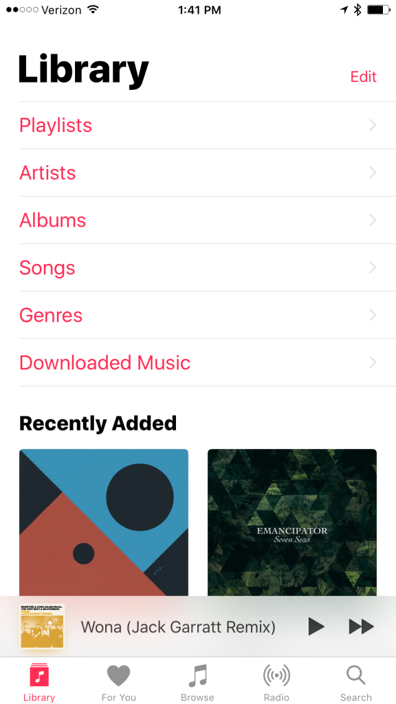
Music for iOS 10 – Library tab
Now Playing and Up Next
The Now Playing screen is much, much cleaner in iOS 10. The buttons to like a song, toggle shuffle, view the album of the currently playing song, and more have either moved below the fold or into the simple (…) menu in the lower right. It makes for a lighter screen that returns emphasis to the current song and its artwork.
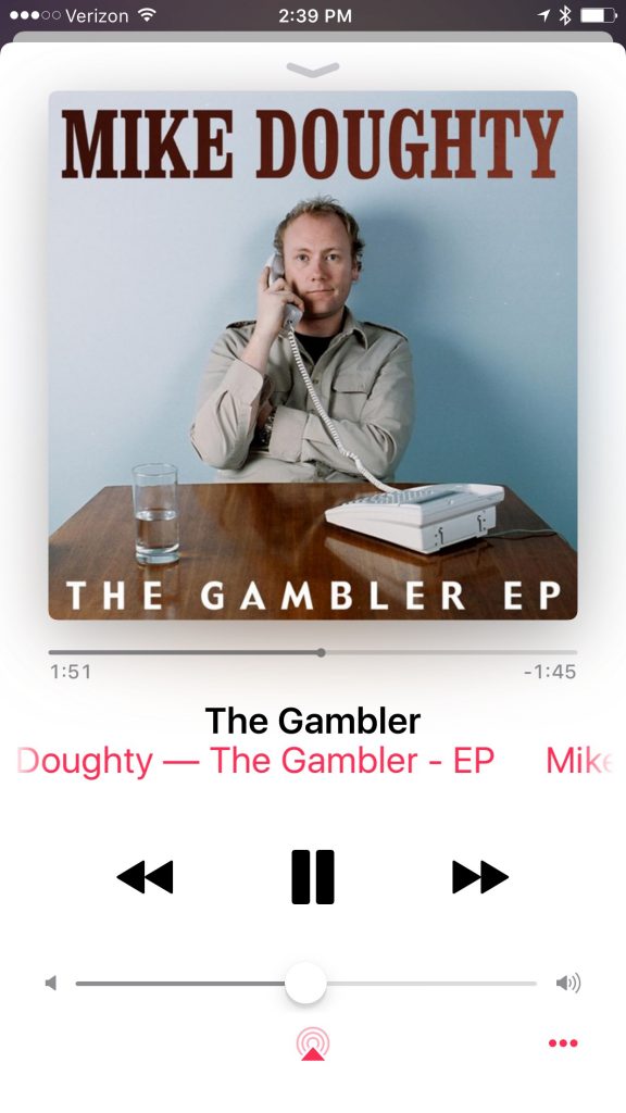
Music for iOS 10 – Now Playing
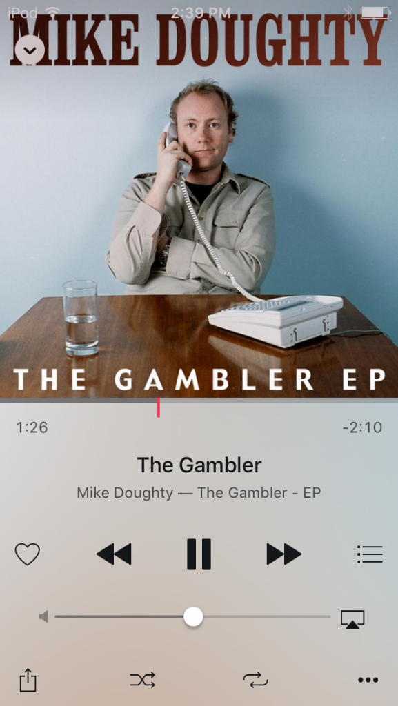
As for controls that moved below the fold, you can now swipe up on the Now Playing screen to reveal the Up Next list, as well as the Shuffle and Repeat controls.
For comparison: Music for iOS 9 – Now Playing
I think this is yet another great change to one of my favorite features in Music (and iTunes). Up Next is now easier to reach with a simple swipe just about anywhere on the screen.
Music for iOS 10 – Now Play and Up Next
Next: Your Library, Horizontal Scrolling, and Faster Access in Music for iOS 10
Page 2 – Horizontal Scrolling and Faster Access in Music for iOS 10
A renewed focus on your library
The tab bar was also reorganized to feature your Library tab first. The For You and Browse tabs for various iTunes Store sections take 2nd and 3rd place. Radio is still there, and Search has moved from the top right corner to its own dedicated tab, replacing Connect.
Now, when Music opens on a fresh start to your Library tab, you’re greeted with your albums, playlists, and genres, as well as music you have recently added—your library. The list uses large labels for clarity, and it’s customizable so you can hide the Songs section, for example, or enable the Video and Composers sections.
For those who prefer to download their purchased or streaming music for offline play, there is a new Downloaded Music section. Tap this, and you enter a sort of alternate reality of your music library where the only items you can see are what is local, on the device. Previously, this option was either difficult to find in Music, or you had to dig into Settings > Music. I think this is a big improvement, and it allows you to leave streaming options available for the times you might want them—it’s a best-of-both-worlds approach.
More horizontal scrolling
The For You and Browse tabs can now show you more major sections (using those large, bold labels) thanks to horizontal scrolling.
These tabs in iOS 9 featured sprawling vertical list of curated playlists and albums that iTunes thinks you might want to hear. In iOS 10, For You has an emphasis on sections like “Recently Played,” “Thursday’s Playlists,” and “Artist Spotlight Playlists.”
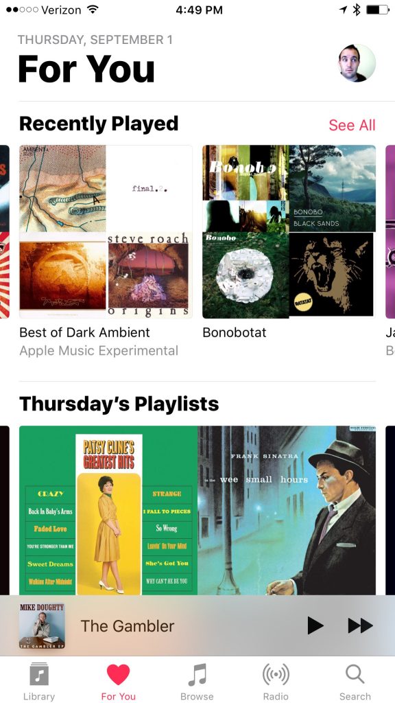
Music for iOS 10 – For You
The Browse tab incorporated the previously dedicated New tab. Think of it as a table of contents for both the store’s catalog and Apple Music. The top has rotating banners of major new releases, exclusives, and other interestingness. Below is a list of labels similar to your Library tab, but sections include “New Music” (in the store), Curated Playlists, and Top Charts.
Faster access and familiarity
These first three tabs—Library, For You, and Browse—are where I sense this strong focus on organization, and I like it. Browsing their previous equivalents in iOS 9 could often feel overwhelming or disorienting.
These new sections make it much easier to reach my library, and make me feel more comfortable diving into Apple Music’s offerings with a sense of direction. It tipped the scale from worrying about getting lost among the digital music shelves to being excited to get lost, because it’s much easier to find my way in and out.
We’ll see how Music in iOS 10 goes over with everyone else, but I’m pretty happy. Of course, there are lots of great little changes everywhere too, so I encourage you to explore.
0 Response to "Music for iOS 10: A Tour of the Big Changes"
Post a Comment