How Apple Maps Iconography Has Grown Over the Years
Mercury Intermedia dove into Apple Maps iconography to give us a history of it, and how it has changed over the years.
Apple Maps Iconography
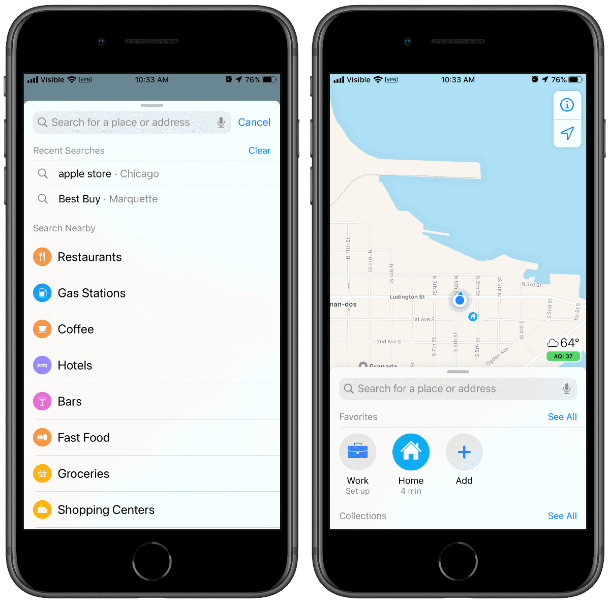
Starting with iOS 6, when Apple took control over Maps, the company introduced a color-coded point-of-interest (POI) icon set. In iOS 8 bigger versions of the icons were used at the system level as part of Spotlight search. iOS 10 gave us a redesigned Apple Maps with the bigger icons within the app itself.
Apple Maps iconography isn’t available as a distinct icon set; they have to be individually tracked down. However, about half of the icon set references the AIGA Symbol Signs. Originally released in 1974, the AIGA Symbol Signs were designed by Roger Cook and Don Shanosky and commissioned by the AIGA and the U.S. Department of Transportation.
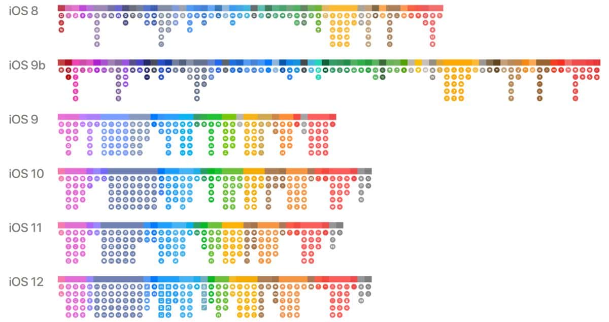
As you can see in the images below, most of Apple’s icons are exactly the same with small changes in some icons. Apple added 37 icons in iOS 9, 17 for iOS 10, and only seven for iOS 11. But iOS 12 saw an increase with 27 new icons. Now, Apple Maps iconography has over 150 icons. Apple has also remained fairly consistent with color coding, too. It will be interesting to see how the icons have changed (or not) in iOS 13.
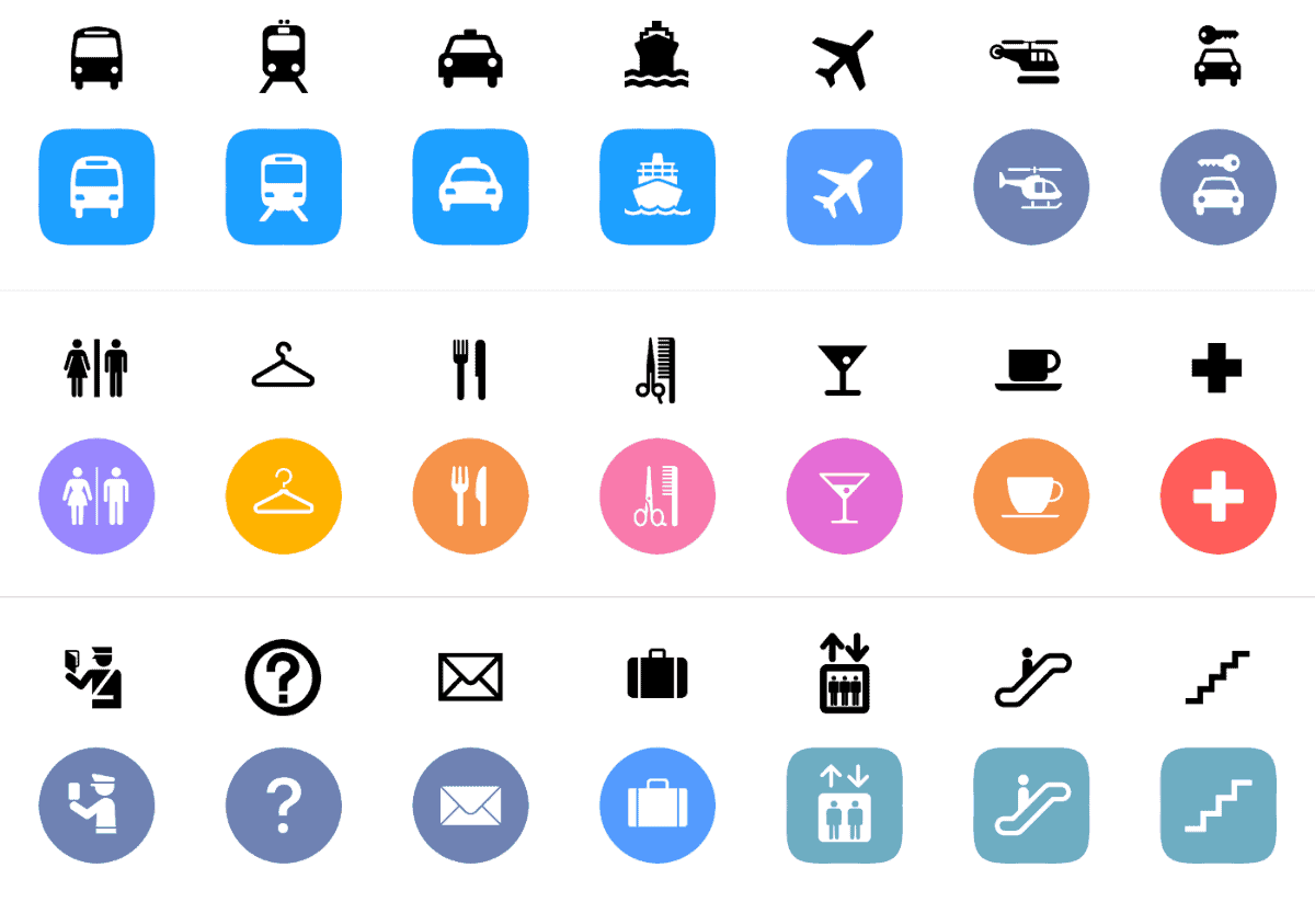
AIGA Symbol Signs on top, Apple Maps on bottom
Icon colors
It will be interesting to see how the icons have changed (or not) in iOS 13.
Icons in iOS 13 PB1
Further Reading:
[DuckDuckGo to Use Apple Maps for Private Search]
[Apple Maps in India Finally Gets Turn-by-Turn Navigation]
0 Response to "How Apple Maps Iconography Has Grown Over the Years"
Post a Comment